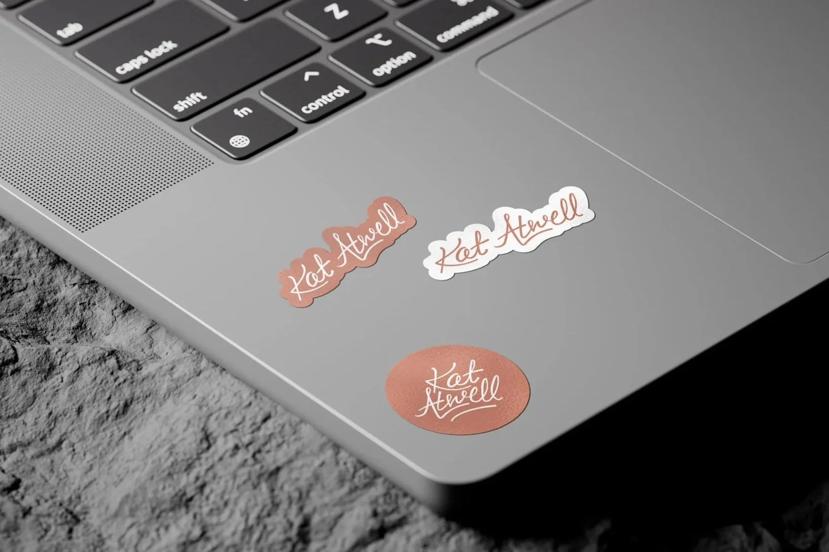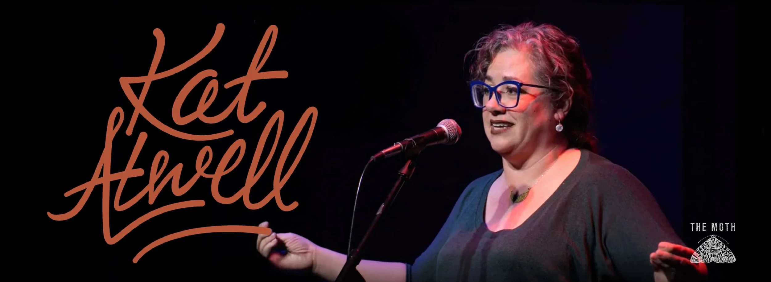
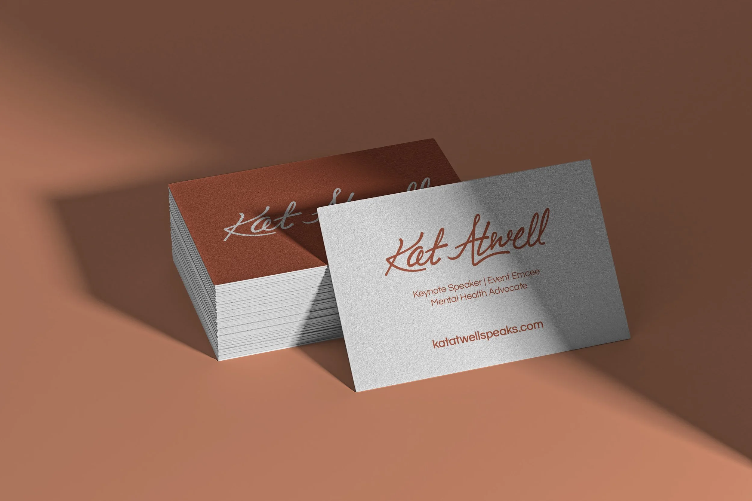
Logo for Kat Atwell
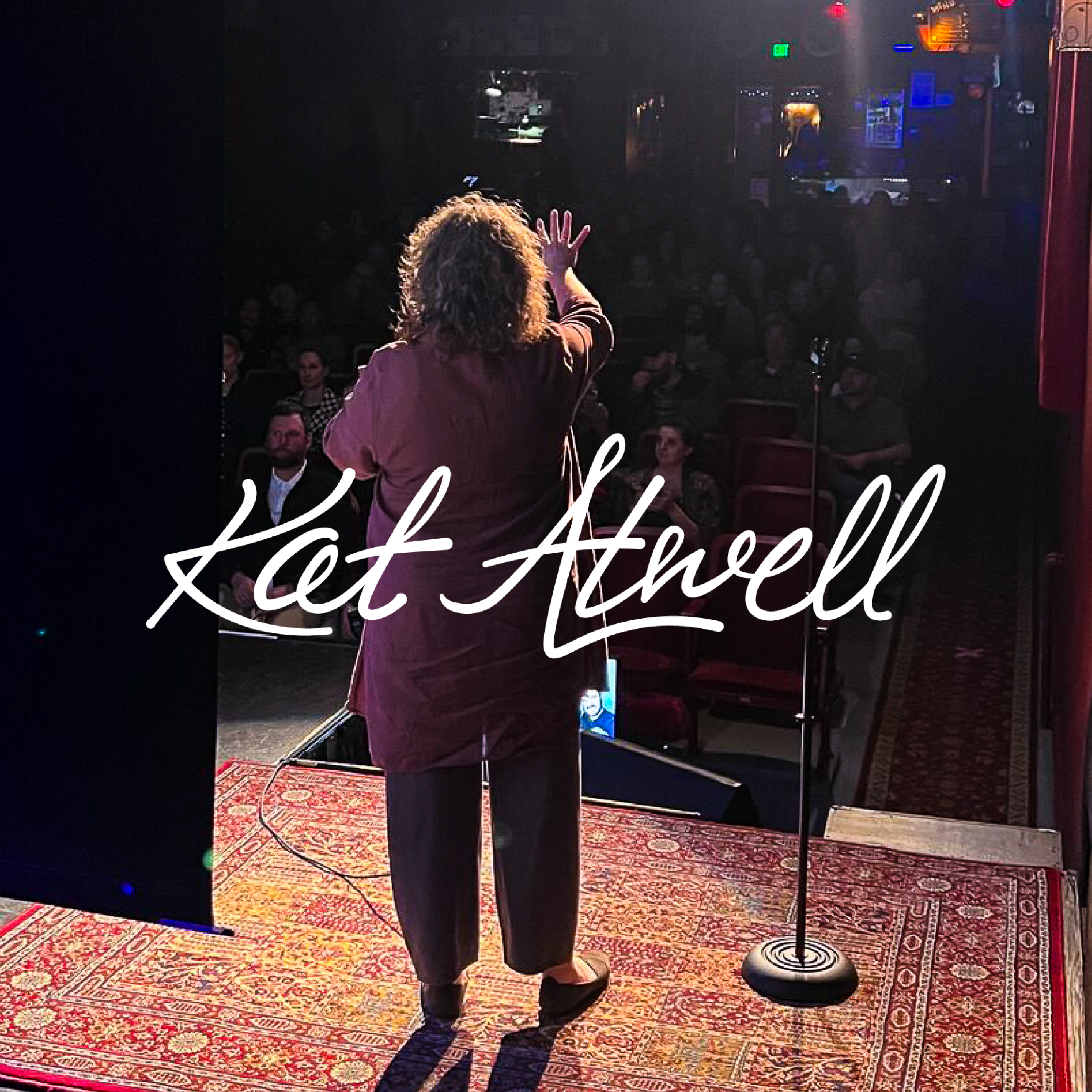
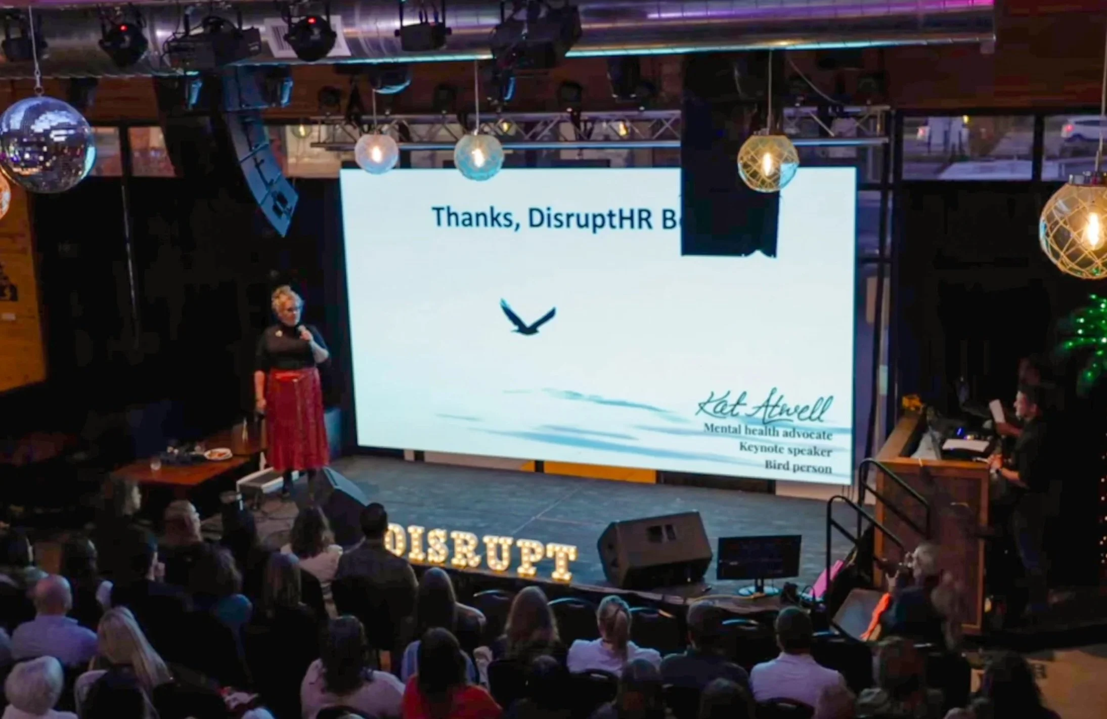
Kat Atwell is a keynote speaker and mental health advocate with a sharp sense of wit and humor, who was looking for a logo that felt authentic and professional.
As a speaker, she is quite literally her own brand. It was very important to both of us that her logo fit her vibe as a person and as a speaker, to set the tone for the personality of her business and accurately reflect how she wanted to present herself.
She already had a color palette selected, which also helped set the tone, so I dived into researching.
Research
Kat wanted to to be distinguishable entirely as herself. Her main goal for her logo was to stand out in the crowded speaker world, and to avoid overused imagery. I spent time researching speakers in the same space to get a sense for what would work best.
I identified three common styles:
Signatures: The person’s name in cursive, either a font or their actual signature
Split signatures: Similar, but part of the name or additional text in a clean supporting font.
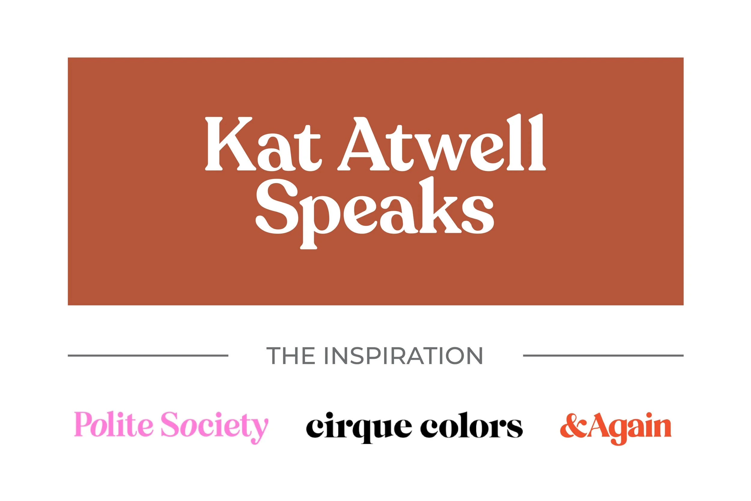
Funky serifs: A polished, but approachable style.
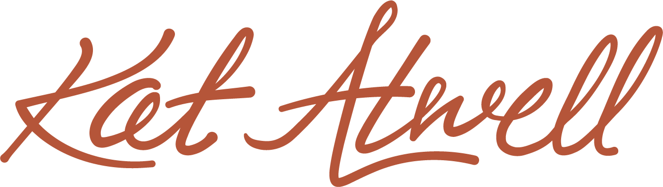
From there I put together a collection of potential directions we could pursue. We decided to use her own handwriting for the signature version, and she sent me a sheet of paper that she’d written her name on dozens of times. I combed through and pulled out the ones I liked best and refined them to better suit as a logo.
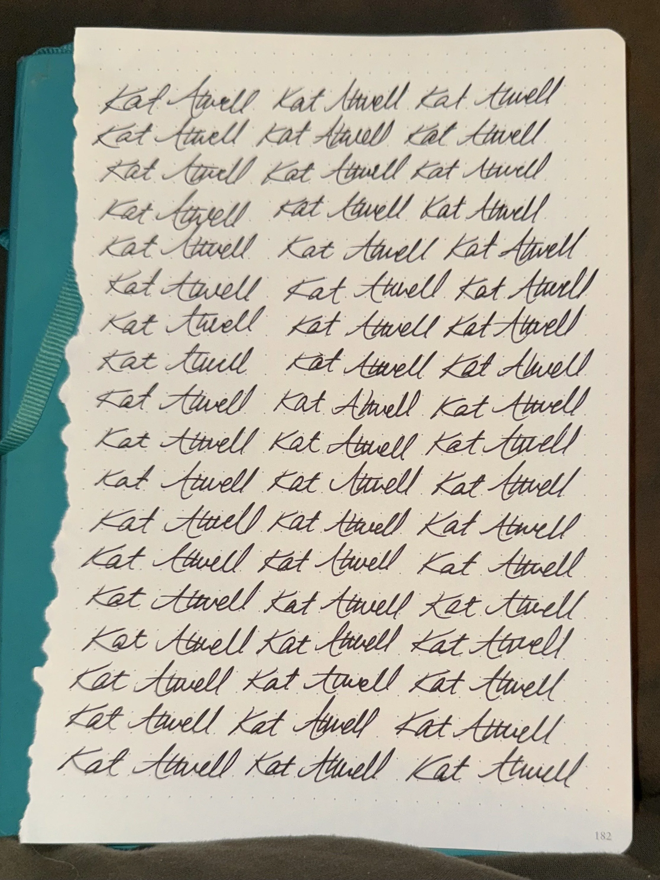
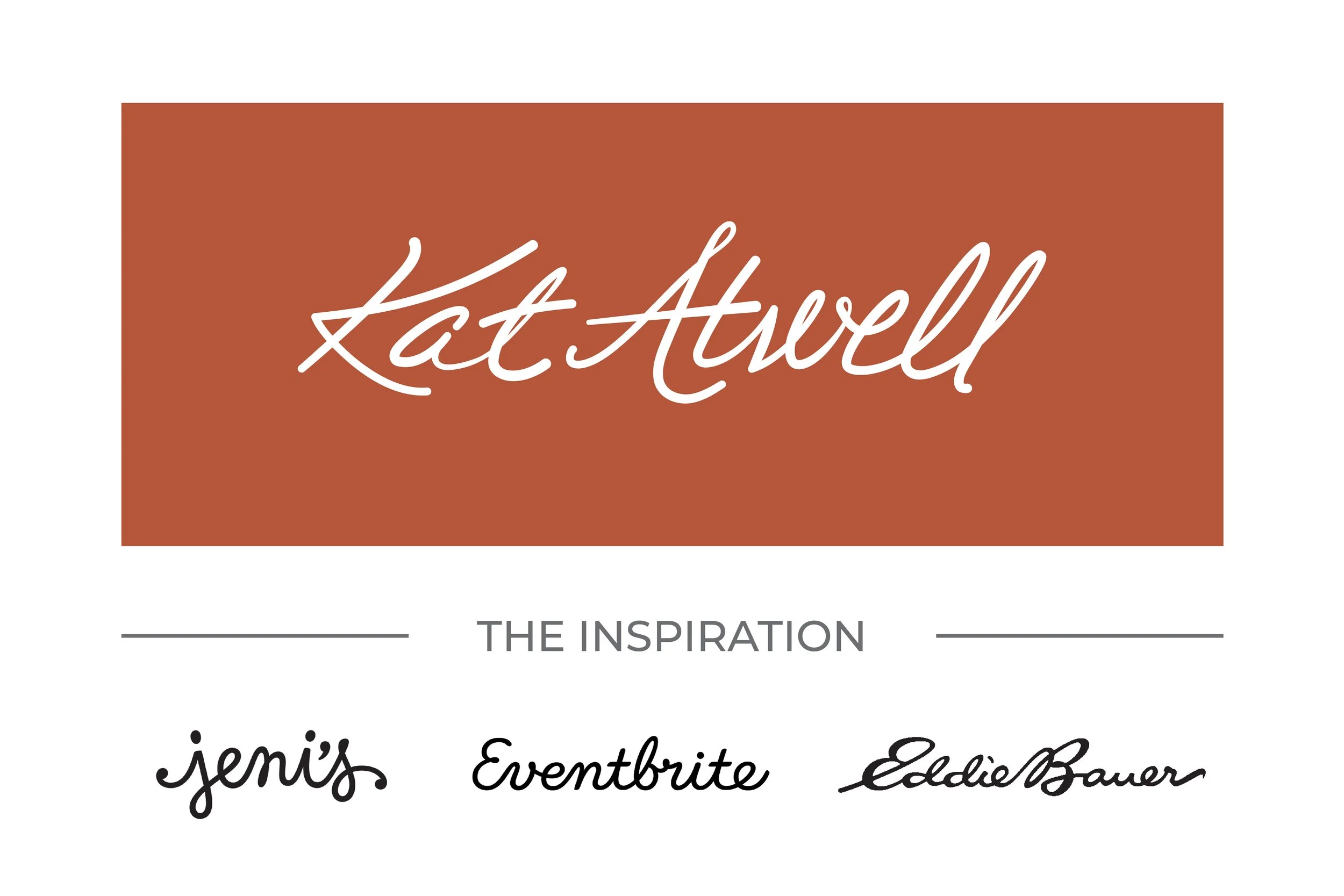
Initial Concepts
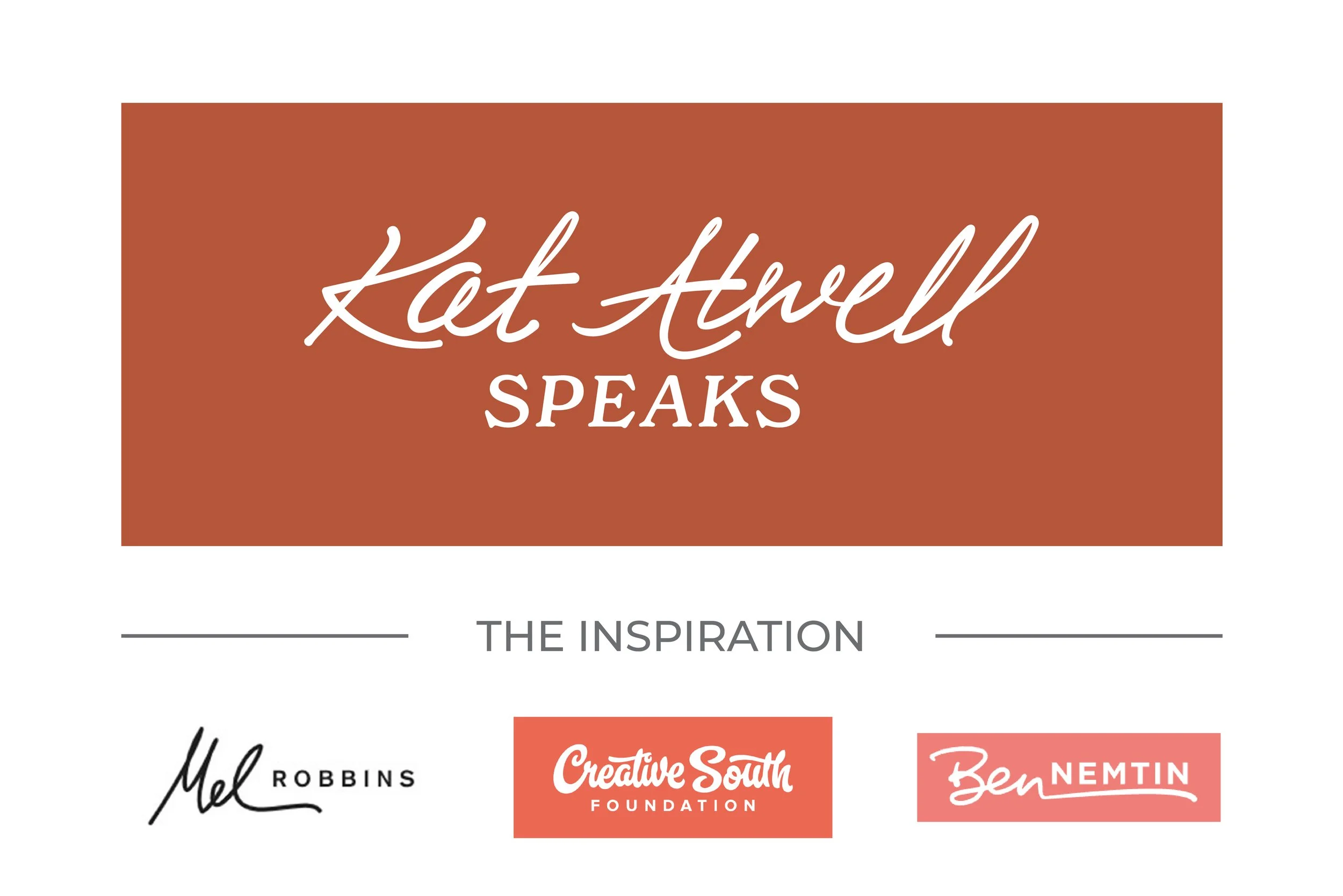
Final Logo
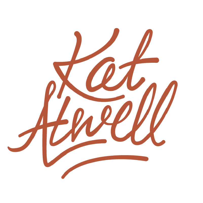
In the end, using her own signature felt like the perfect fit. I took the initial concept and built out both a primary and a stacked secondary option. I modified the letters slightly to fit the stacked version and adjusted the primary to version to visually relate. They’re different, but similar, in the same way that each time you write your name looks just a little bit different.